Pareto Chart
A pareto chart is a graphic representation of data that shows two things:
- Ranked causes for individual outcomes and
- A line that shows the cumulative result from all causes
It is vertical bar graph showing frequency of the outcome in descending order from left to right. The highest frequency issues are on the far left of the graph.
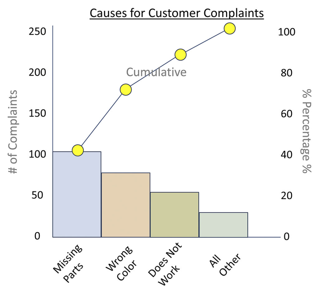 Pareto charts show information about the frequency of a problem so you can focus on the most significant ones. This chart also helps communicate to others about issues and opportunities.
The Pareto Principle suggest that 80% of the causes of any problem come from 20% of the total causes. And, if we focus on the most critical few issues (20%), we will solve most (80%) of the total problems. In the chart shown here, approximately 80% of the problems come from just 3 categories.
« Back to Glossary Index